Rytual by Superior Type NEW, April 2026!
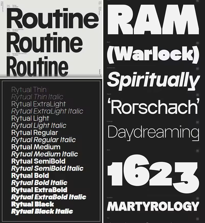
Regular | Condensed | Extra Condensed
18x3=54xOTF | 1xTTF Variable | 10 MB
The name came from a running. Same time, same route, whatever the weather, coffee after. A Rytual. The typeface follows the same logic: no single dramatic move, just one decision repeated consistently until the character accumulates. What started as a custom job for a friend grew into a full family, shaped by the rhythm that ran alongside it.
Rytual is a grotesque built on clean, modern forms with a slightly narrow stance. Pointed terminals are cut away and replaced with sharp, rectangular endings, giving the letters a more constructed, precise quality throughout. The same logic carries into letters with fully or partially rectangular constructions, keeping the feeling consistent across the set. Narrow by nature, not by force. Stylistic alternates and three widths (Normal, Condensed, and ExtraCondensed) round out the system.
Quick check before we show the links
Helps us keep automated scrapers from hammering the filehosts.